7.31.2006

Christopher Deane


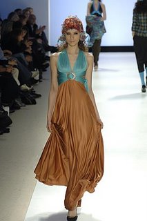
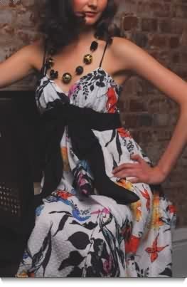
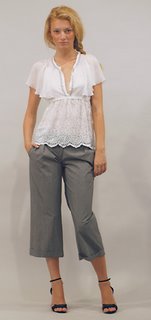
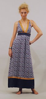
Here is the Fall 2006 collection from Christopher Deane; what to say but the whizkid duo is at it again. The Fall collection has its roots in incredibly well structured but flirty pieces; muted taupe, ivory, navy and black are highlighted by subtle texture and prints that are at once classic and modern. As usual the collection is a must see.


Fall Winter 2006

Hey there....I know it's August but we're about to break out the Fall goods here. You will see updated Fall collections here from designers I've mentioned before, along with some new names. So sip a cool drink or bask in the air conditioning, Fall is one of the most exciting seasons for fashion. Retailers/PR, I will be sending out my subscrition only newsletter with "must see" picks for the tradeshows. Email me (clothespinblog@gmail.com) if you want to subscribe.

7.28.2006

Kara Janx 2

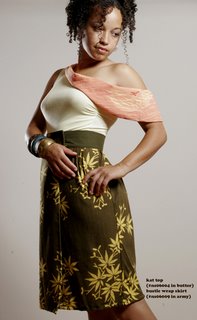
The now infamous Kara Janx kimono wrap dress meets Fall 2006 in 100% silk. Yumm. Kara has really made a name for herslelf with a bold, sexy, and incredibly feminine collection. The dress and multi wrap skirts (below) are just a small element of this collection; the entire line is laden with color and texture including silk screened tees, tailored blazers, and adorable wool shorts. Like everyone else though, I'm a sucker for the kimono dress in all the colors which are already backordered for two weeks. Take a look at Fall line here and shop or contact to carry in your store. Enjoy!

P.S If anyone is interested in the runway pieces you should definitely contact Kara herself (no showroom as yet it seems).

7.27.2006

Kara Janx

I'm lucky to be catching Kara's trunk show later so I'll report tomorrow in full when I get an up close and personal. I couldn't wait to show you this though; the Kara Janx collection from Olympus fashion week. The colors, the mood , the detail is incredible! It's very urban girl plays dress up kind of feel; as if to say I may be hot but I can kick you a**. Enjoy and I'll be back tomorrow with more on the Fall collection. Thanks to Lauren for turning me on to Kara (yes she is from Project Runway).


7.26.2006

Nica Celly

I was breezing through a tradeshow recently when I saw this collection and it stuck with me a bit; it is a beautiful collection and a tight knit group of very specific styles. I have noticed that there is a new appreciation for crafters today; it seems people are no longer turned off by the fact that a human hand was involved in design. I bring this up because I think this Nica Celly has hit upon a nice compromise between composition and craftsmanship. The styles are totally wearable but they have a extra touch and definitely a human handprint. Oh yeah, and it's for women who eat...food. Check it out here.

7.25.2006

Kirrily Johnston


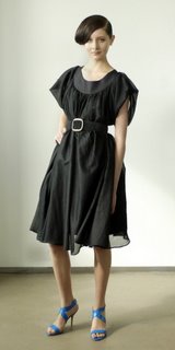
I discovered Kirrily Johnston through the Elizabeth Charles boutique and have fallen hard for this one. Kirrily is only a few seasons old but has developed a collection that has already settled into a signature. My favorite aspect of this line is that it's designed from a very simplistic point of view. A few bold hues (orange and blue for spring) balance a neutral palette, but she plays with shapes and details alot; I think it has a wonderful childlike quality while remaining sophisticated and very wearable. Love the dress in the middle.

sorry so long to post today, blogger had issues :)


7.24.2006

Rachel Leigh

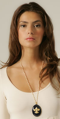
Black and gold is one of the world's most classic combinations (unless it gets in the wrong hands...sorry Donatella); so I was excited to find this collection while perusing Shopbop. Rachel Leigh really takes the look and updates it in a most modern way. As I think we've all noticed vintage has been revived in a big way in our wardrobes the last few seasons; whether the higher waist pant of late, the pointy low shoe that won't quit, or the boudoir style jewelry. I love that this collection fuses quality materials (vintage style is best known for good materials) with a refreshed look. Love it all the way...check out the collection here.

photo credit: shopbop

7.21.2006

Gr. Dano

This is exactly what I meant when I said designers can take a current item and bring it to another level. If this isn't one of the lovliest takes on a pea coat then I don't know what is! Designers Jill Giordano and Brian Scheyer incorporated their respective fields of fashion and graphic design to create Gr. Dano. The collection is designed for the professional gal who needs a little more ooomph in her suit. Structual details are plentiful but still easily wearable.

7.20.2006

Sofada

It would seem that I have a preference for vintage looks, but I'm noticing most designers are really reaching back into grandma's closet for a little inspiration. The best part is that they are adding a little kick to the collection which is fabulous for bringing the look up to date. I ran into Sofada yesterday while searching for something else entirely and thought I'd share. Based in Portland, designer Alice Dobson keeps her vintage looks a little more on the sweet side.

7.19.2006

A quick and painless personal note....


I'm now on both sides of the table when it comes to trade shows. As a vendor you stand around trying to look welcoming and hoping that you've got what buyers want, as press you notice that welcome look is really a manic desperation..."BUY MY LINE...please".
Yesterday I visited Project and Pool for the first time from the "press" point of view. I saw only a few people I know (Hi Rena!!), but all around it was a very slow show. Most buyers wait until Las Vegas to do exhaustive buying all at once instead of taking two trips to see the same thing. Here's where I vent...the contemporary industry is loaded with designers trying to plug themselves into a very crowded space. Truly of the 10 or so new denim/tee shirt collections I saw yesterday there was little difference between them and their neighbors...the wash? the fit?..not really. What would make me walk to your booth rather than the next? Some people went for gimmicks, soem tried with tricked out clothing, others even laid their products in the aisles.
Very few designers 1) expand and improve an existing product or 2) create a product that fills a space...whether for function or design. The contemporary design world is one steriods right now, small designers are competing against brands like Nicole Fahri, JPG -Jean Paul Gaultier, etc. What??
You may not be the next True Religion or Seven but you will begin to create a name and signature for yourself if you stick to your guns instead of hopping on the trend wave. In the end I enjoyed Pool because it consisted of people who are putting their heart and soul into their work. It has to be tough buying for a store but I think it's even harder determining what vendors to introduce to customers when most of them look as though they'll be around for this season only.
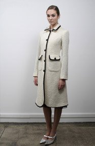
Ingwa Melero

I know...I know. It's not that you haven't heard of them for goodness sakes, but you must admit their work is lovely. Nike Ingwa and Tina Melero grew up as friends in a small town in Germany and spin cycle years later they are now a design team with quite a following. The duo launched the colection in 2001 and incorporated their mothers handcrafting techniques into feminine silhouettes. What I love in particular is that the collection (especially the dresses) allows a younger customer to incorporate a very sophisticated silhouette into their wardrobes, yet it's still fresh and contemporary. Check them out here or find the looks above at Girlshop.
7.18.2006

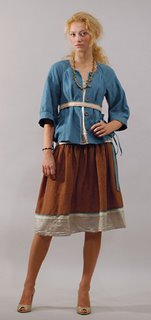
Bon & Ging

Bon & Ging is designed by sisters Nanette and Grace Sullano. You can probably guess that one of the sisters has a degree in architecture by the linear details found throughout the collection. The spring collection was inspired by southwestern films and the lansdcape; although I find the muted colors to be a theme through all of their seasons. The dress below is from the Fall 2005 line, but I just loved the long lean look with a hint of peek-a-boo.

7.17.2006

Alexandra Vidal

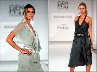
The name sounds familiar right? Alexandra Vidal was one of the designers on season two Project Runway (she was the 6th designer cut). I found out she was a part of Gen Art and I must say I loved what I saw. Alexandra's look is very current with vintage influences; in this case I like that it's not just a pin or a trim but the actual fabrication that has a vintage flair. Alexandra's site is not very current, (hopefully that means she's pretty busy) but you can see the growth between the style showcased and her past collections. Maybe Project Runway is really good for allowing designers to expand their style.

7.14.2006

Kristen Aronsson

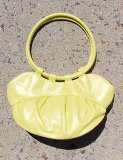
I had the pleasure of meeting Kristen Aronsson recently and I really liked her take on design. Kristen believes in using the best materials paired with sculptural details and simple shapes. I love speaking to independent designers because their vision comes from a place entirely outside of the trends and pressures of the "it" world. Inspired by her urban surroundings and her love of space and shape, Kristen creates these sweet bags for the lady who prefers not to be overtaken by her accessories. Not a bad idea at all.

Malicious Designs- summer friday

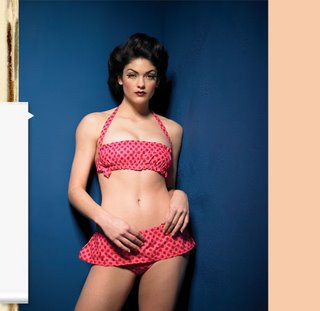
Bad girls get all the best outfits...leather, spikes, whips... you get the idea. Malicious Designs has a unique vision of the naughty girl though; lace, ruffles, dots, and bows...hmmm I like. Designer Sheana Hinsley took a break from life on the road to create MD for the woman who likes a good bar fight. What the heck was she doing on the road exactly? Anyway the collection has a cute retro vibe and personally I think it does a lot more for you after you leave the bar :) Check it out here.

7.12.2006

Wek1933


You may be familiar with her name or looks as the lengthy runway model, but Alek Wek has other talents besides looking flawless. I heard about 1933 when it was launched a few years ago and was pleasantly surprised to find that it wasn't bedazzled, overdone, and refried. Inspired by the clean lines of her late father's briefcase, she created a sophisticated collection meant to become a lasting and cherished item. My favorite aspect of the collections are the rich, saturated tones and the simplicity. I've never been a "jingles and jangles" gal when it comes to my travel bags.

7.11.2006

Kareen Smith

Sorry I'm a little late today I had a morning meeting; today will be a quick post. I love the style of Kareen Smith...my only qualm is that designers need to understand the importance of an online prescence. Unless Google is just useless today, I'm having no luck. You can see her collection here at Unsung Designers or I believe she is still a regular at The Market NYC (a great resource for anyone who wants to be face to face with stores, press, and customers).

7.10.2006

Anna Cohen

I think we've all been waiting for this; sustainable design that is actually well designed. It's a fine line that one, many companies chase the eco friendly concept and the result can be pretty awful. The idea of natural or recycled fibers in design is often paired with a concept that people who appreciate are partial to wearing garlands of flowers in their hair. So, needless to say I was so excited to find Anna Cohen. Faced with this very dilemna Anna launched a collection of "Italian Street Couture" that uses 75% sustainable materials and 25% unsustainable (buttons and very little dye). Take a look here and read about Anna's vision here.

7.06.2006

Freddy & Ma


Here's the pitch; a superhero and her sidekick find themselves in a rut. The advent of the "it" bag and knockoffs are draining Gotham City of all it's style. "What to do" says Freddy to Ma? I know! We'll create a collection of bags that can be personalized by choosing your own shape and fabric. That ought to put a stop to it! By Fall 2007 all was right with the fashion industry ...
please forward all calls to my agent. Anyway, there is some truth to the my little skit and I was pretty excited to hear about Freddy & Ma. Siblings Anthony and Amy created their accessory collection out of frustration with the mass marketed, heavily imitated, and mundane labels. They work with independent textile designers to create a diverse collection of prints that can be paired with classic shapes (my fav is the bowler with pattern by Amy Holdsworth). Take a look at the full collection here.


7.05.2006

Tiny Armour

Designer Angi Glenn has a background in film and animation, combine this with her love of 80's pop culture and you've got a store of ideas for jewelry design. Here's an idea of her inspiration: My Little Pony, Pac Man, unicorns, monsters...nostalgic yet? Angi also highlights a sense of humor and social responsibility in her designs such as the "fast food chain", "pill capsule", and grenade necklace. Find Tiny Armour at one of my favorite stores startandinfinitedarkness.

Mint


I absolutely love this collection. Mint is a fairly new line that is already making waves in the contemporary world. Designer Jodi Arnold added vintage details to classic feminine looks and created a collection worth the...herbal qualities. Tough to find in contemp. design. Bravo!


7.03.2006

Tivi

Leave it to men to describe their products as 'an intercourse between industrial materials and intelligent design'. Eh, this time I'll have to agree with them. Designers Ryan and Paul have managed to seamlessly combine lux materials with modern design. Feuled by intimidating moments of holding women's handbags, they put their embarrassment to work researching and developing Tivi. Combining craftsmanship with stainless steel, leather, and wood they have created incredible unique, wearable pieces. Each style allows you to choose the leather and wood for a unique to you look. Sigh, they just might be perfect.

Blog Widget by LinkWithin